Typography Basics: The Key Terms and Rules Every Beginner Should Know
Typography basics cover two things: the vocabulary for describing letters and the habits that make text comfortable to read. This guide explains the terms designers use, from baseline and x-height to kerning and leading, then the rules for line length, spacing, pairing and scale, with examples from Gutenberg to a 2025 government font dispute.
Typography basics begin with a few terms
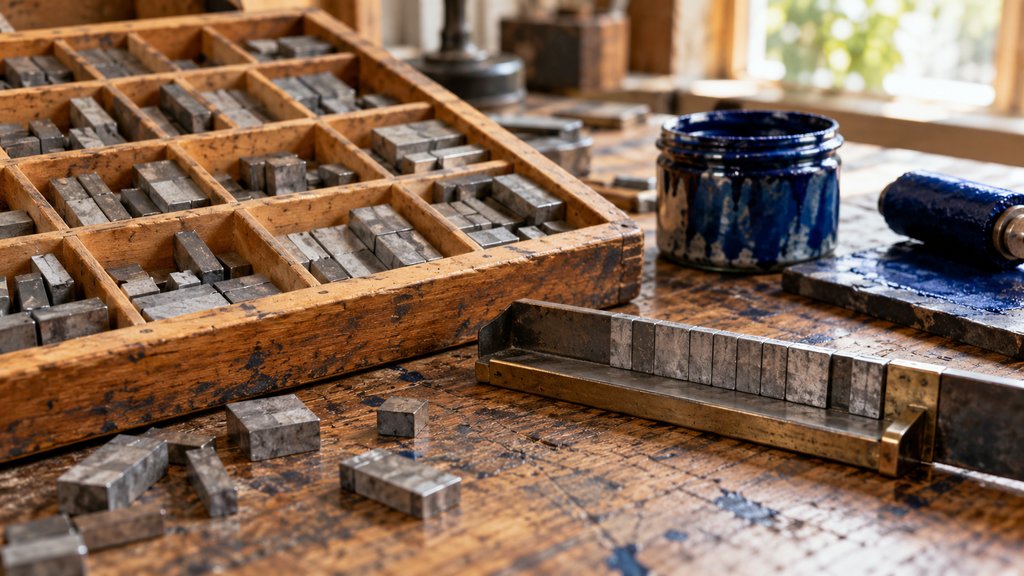
Typography is the arrangement of letters so that text can be read, ideally with pleasure. The craft dates back to Johannes Gutenberg’s movable metal type in Mainz around 1450, and much of its vocabulary still comes from that workshop. Learning typography basics is mostly learning those words, because once you can name a problem you can usually fix it.
A typeface is a design; a font was originally one size and style of it, cast in metal. Garamond is a typeface, and 10-point Garamond italic was a font. Digital tools blurred the two words long ago, and nobody is likely to be corrected in conversation. Still, the distinction matters when you buy licences, which are often priced per style.
Typography terms for the letter itself
The baseline is the invisible line letters sit on. The x-height is the height of a lowercase x, and it decides how large a typeface looks at a given size. Cap height measures the capitals. Ascenders rise above the x-height, as in b and h, and descenders drop below the baseline, as in p and g.
Serifs are the small finishing strokes at the ends of letters. Times New Roman, introduced by The Times of London in 1932, has them; Helvetica does not. Helvetica began life in 1957 as Neue Haas Grotesk, drawn by Max Miedinger with Eduard Hoffmann in Switzerland, and was renamed a few years later to sell abroad. The new name worked.
Weight describes thickness, from hairline and light through regular to bold and black. Width runs from condensed to extended. A family is the full set of weights, widths and italics drawn to work together. Paul Renner’s Futura, released in 1927, shows how far a family can stretch while every member still reads as the same geometric design.
Typography terms for spacing: kerning, tracking, leading
Kerning adjusts the space between two specific letters. Pairs such as AV, To and Wa leave awkward gaps unless the second letter is tucked closer. Good fonts carry built-in kerning tables, yet large headlines and logos usually need manual correction. Tracking, by contrast, changes the spacing across a whole word or line at once, and it is often overused.
Leading is the distance from one baseline to the next. The term comes from thin strips of lead that compositors slid between lines of metal type. Tight leading makes paragraphs look dark and heavy; loose leading makes lines drift apart so the eye loses its place. Body text usually sits at about 1.3 to 1.6 times the type size.
Typography basics rules for readable text
The first of the rules concerns line length. Robert Bringhurst, the Canadian poet and typographer, recommends roughly 45 to 75 characters per line for a single column of text, with about 66 as a comfortable average. Lines much longer than that tire the eye on its way back to the left edge. Much shorter, and reading becomes choppy.
Size and contrast come next. Body type that is too small or pale fails readers before anything else matters. On the web, accessibility guidelines from the W3C ask for a contrast ratio of at least 4.5 to 1 between normal text and its background. Grey type on white often misses it, which is easy to check and easy to fix.
A few other rules hold up in almost every situation. Avoid setting long passages in capitals, because uppercase words lose their distinctive shapes. Use real quotation marks and apostrophes, not the straight marks a keyboard produces. Do not stretch or squash letters to fit a space. And watch for a single word stranded alone at the top of a column.
Pairing type and building a scale
Most projects need only two typefaces, one for headings and one for text, and many good ones use a single family in several weights. Pairing works best when the two faces differ clearly, such as a serif with a sans serif, while sharing proportions like x-height. The font pairing tool suggests tested combinations for practice.
A type scale sets the size steps between body text, subheads and headlines. Rather than picking sizes by eye, designers multiply a base size by a fixed ratio, such as 1.25 or 1.333, so every step relates to the others. The type scale calculator does the arithmetic and shows the results at real size on screen.
Two Canadians who shaped how type is taught
Carl Dair worked on a Canadian typeface for more than a decade, and his Cartier, named after the explorer Jacques Cartier, was released on January 1, 1967 as a centennial gift. The Canadian Encyclopedia describes it as the first typeface for text composition designed in Canada. Dair died that September, before he could refine it.
Bringhurst’s book The Elements of Typographic Style, first published in 1992 by Hartley and Marks, became a standard text in design schools far beyond Canada. It has been revised many times since, most recently as version 4.0 in 2012. Few textbooks are quoted so often in studio arguments about spacing, or so rarely read cover to cover.
When a font becomes news
Typography basics occasionally reach the front page. In 2023 the US State Department replaced Times New Roman with Calibri, citing readability for people with low vision and dyslexia. In December 2025 the department reversed course. A cable dated December 9 ordered Times New Roman at 14 points for official documents, calling the sans serif informal by comparison.
The episode shows one of the typography basics in public: type carries tone as well as text. Serifs read as formal to many people, sans serifs as modern and plain, though research on which is easier to read gives no simple winner. Which of the two looks more official to you, and would a reader decades from now agree?
Questions about typography basics
What are the 5 basic types of typography?
The usual five categories are serif, sans serif, slab serif, script and display or decorative. Serif faces such as Times New Roman have small strokes at the ends of letters. Sans serifs such as Helvetica do not. Slab serifs have heavy, square serifs, scripts imitate handwriting, and display faces are built for large sizes rather than paragraphs.
What is the difference between a typeface and a font?
A typeface is the design, such as Garamond or Futura. A font was originally one size and style of that design cast in metal, for instance 12-point Garamond italic. In digital work the words have blurred, and most people use them interchangeably. Designers still say typeface when they mean the overall design family.
What is the 3 font rule?
It is a rule of thumb that a single design should use no more than three typefaces, and usually two is better. One face for headings and one for text covers most needs, with a third reserved for something special such as captions or numbers. More than three tends to look accidental rather than planned.
What is the best font size for body text?
For printed books and magazines, body text usually sits between about 9 and 12 points. On screens, 16 pixels is the common default for body copy, and many sites go larger. The right size depends on the typeface, because two faces at the same nominal size can look very different when their x-heights differ.
What is leading in typography?
Leading is the vertical distance from one baseline to the next. The name comes from strips of lead that hand compositors placed between lines of metal type to space them apart. For body text, a line spacing of roughly 1.3 to 1.6 times the type size is typical, with longer lines needing more space.