Golden Ratio Calculator for Design and Typography, With Myths Checked
This golden ratio calculator splits any length into two parts whose proportion is φ, about 1.618, or extends a length by the same factor. Below it, the maths in plain terms, the places the ratio really helps a layout or a type scale, and the famous claims about logos and temples that do not survive a tape measure.
Split by φ
| Total (a + b) | |
|---|---|
| Longer part (a) | |
| Shorter part (b) | |
| Next step up (total × φ) |
What the golden ratio calculator does
Divide a line so that the whole is to the longer part as the longer part is to the shorter, and the ratio you get is φ, about 1.618. The golden ratio calculator above does that split for any number. Enter 1200 pixels and it returns about 742 and 458. Enter a short side and it gives the long one.
It also runs the other direction. Type in a heading size or column width and it multiplies or divides by φ as often as you ask. The resulting sequence is the useful part, because every number shares one proportion with its neighbours, and the eye tends to read that consistency as order.
The maths behind φ, in plain terms
The exact value is one plus the square root of five, divided by two. As a decimal it starts 1.6180339887 and never repeats or ends, because φ is irrational. Two quirks make it famous among mathematicians. Its reciprocal is φ minus one, about 0.618. Its square is φ plus one, about 2.618, a coincidence no other positive number shares.
Euclid described the division around 300 BCE in Book VI of the Elements, calling it cutting a line in extreme and mean ratio. Fibonacci published his rabbit-breeding sequence in Liber Abaci in 1202. Divide each Fibonacci number by the one before it, 8 by 5, 13 by 8, 21 by 13, and the results close in on 1.618.
The name came much later. Wolfram MathWorld notes that the term golden section seems to appear first in Martin Ohm’s 1835 textbook, and that the Greek letter φ was apparently first used for the ratio by Mark Barr early in the twentieth century, a nod to the sculptor Phidias. Luca Pacioli had already called it the divine proportion in 1509.
Golden ratio design: columns, cards and canvases
In layout design, the ratio is most practical as a column split. A 1200 pixel content area divided by φ gives a main column near 742 pixels and a sidebar near 458. Percentages make it responsive: 61.8 and 38.2. The result feels less symmetrical than halves and less lopsided than a two-to-one split, which is the whole appeal.
Rectangles are the second use. A golden rectangle, about 1.618 by 1, sits between the squat 4:3 of an old screen and the long 16:9 of a television. The aspect ratio calculator shows how close common formats come, and few match it exactly because paper and screens follow other standards.
Le Corbusier went furthest. His Modulor system, published in 1948, combined human height with φ to produce two series of measurements for buildings, furniture and windows. The Unité d’Habitation in Marseille, completed in 1952, used it throughout. It remains the clearest case of an architect applying the golden ratio on purpose, not found later by someone with a ruler.
Using the golden ratio calculator for a layout grid
A practical routine starts with the container. Measure the full width, run it through the golden ratio calculator and use the larger result as the main column. Then run the smaller result through again to set internal spacing, so a 458 pixel sidebar might take 283 pixels of content plus margins. The numbers stay related all the way down.
The approach has limits. Real content rarely respects a proportion: a long table needs width, a photo has its own shape, and phone screens collapse everything into one column anyway. Treat φ as a starting point you can bend. The grid layout design guide covers column systems that flex more gracefully than a single fixed split.
Golden ratio typography: type sizes and line length
In typography, the most common use is a modular scale with 1.618 as its multiplier. From a 16 pixel body size, the next sizes are about 26, 42 and 68 pixels. Those are dramatic jumps. They suit a poster, a book cover or a one-screen landing page, where only two or three sizes appear.
Longer documents usually need gentler steps such as 1.25 or 1.333, which fit more levels between body text and the largest heading. The type scale calculator compares those ratios side by side. Some designers borrow φ for line height too, setting 16 pixel text on lines near 26 pixels, which feels loose on wide measures.
Book designers have long discussed page proportions. Robert Bringhurst’s The Elements of Typographic Style, first published in 1992, treats the golden section as one classical page shape among several, next to simpler ones such as 2:3 and 3:4. That framing is sensible. It is a good proportion, one of many, and never a requirement for a beautiful page.
Golden ratio myths: logos, temples and faces
The Parthenon is the classic case. George Markowsky’s 1992 paper in The College Mathematics Journal showed that writers measure the facade between different points, and the published figures do not give 1.618 consistently. No ancient source says the builders used the ratio. You can draw a golden rectangle over the temple, but you can draw plenty of other rectangles too.
Logos attract the same treatment. Golden circle overlays on the 1977 Apple mark appeared online decades after it was drawn. Circles fitted after the fact can match nearly any curve. The same goes for the Mona Lisa and for apps that score faces, whose golden ratio claims have no scientific basis.
Markowsky also tested preference directly and found that people did not reliably choose golden rectangles over others, nor could they pick them out of a lineup. Earlier experiments by Gustav Fechner in the nineteenth century had suggested a preference, and that result has proved hard to repeat. The ratio is pleasant, and so are its near neighbours.
Where φ really turns up
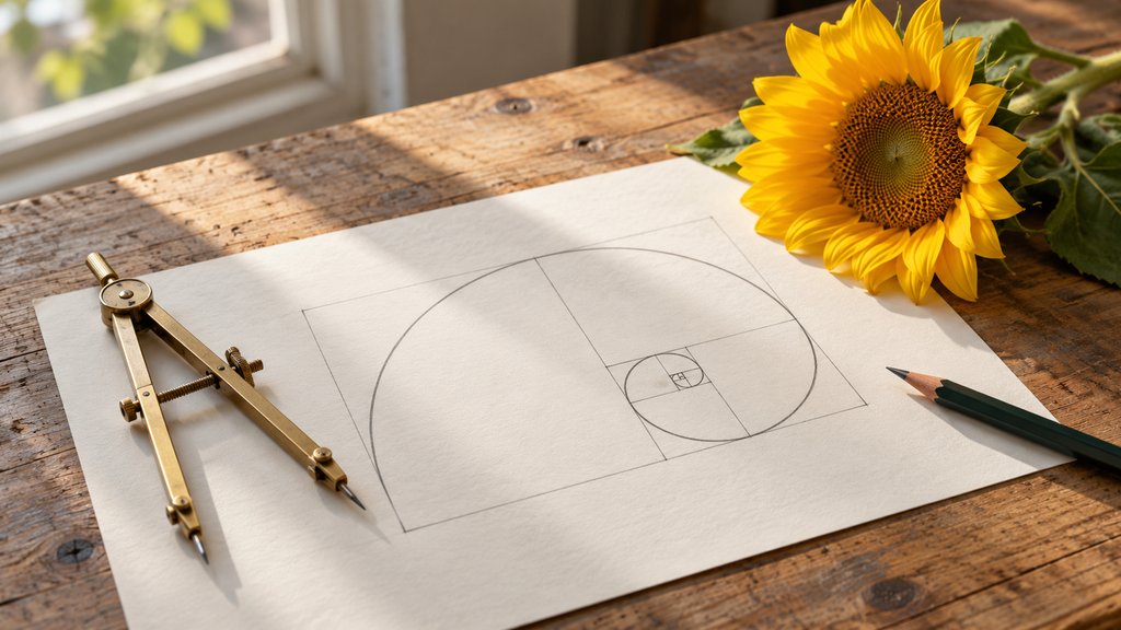
Nature offers a better case. Many sunflower heads show seed spirals in Fibonacci counts, often 34 one way and 55 the other, because each new seed grows at roughly 137.5 degrees from the last. That angle, the golden angle, packs seeds efficiently. It is a real pattern that botanists study, not a decoration added afterwards.
The nautilus shell is a famous mistake: measured shells widen more slowly than a golden spiral would. A golden ratio calculator cannot settle such claims; a tape measure can. The number is real in mathematics, real in some plants, documented in the Modulor, and inflated almost everywhere else. Fibonacci, for what it is worth, was writing about rabbits.
Questions about the golden ratio
How do you calculate the golden ratio?
Take a length and divide it by 1.618 to find the longer part, then subtract that from the whole to get the shorter part. For 100 units the parts are about 61.8 and 38.2. The exact value of the ratio is one plus the square root of five, all divided by two, which works out to 1.6180339887 and continues forever.
What is the golden ratio used for in design?
Designers use it for proportions: a column and sidebar split, the shape of a card, or the step between heading sizes. It is a tool for consistency, since every measurement then relates to the others. Simpler ratios such as 2:3 or 3:4 do the same job and are often easier to work with.
Is the Apple logo based on the golden ratio?
There is no evidence it was drawn that way. Diagrams fitting golden ratio circles over the 1977 apple circulated online decades after the mark was made. Circles can be fitted after the fact to almost any curved shape, so such overlays show that a match is possible, not that the designer intended it. Treat them as a later illustration.
Is the Parthenon built on the golden ratio?
The claim is widely repeated but poorly supported. Mathematician George Markowsky showed in 1992 that writers measure the facade between different points, and that published measurements do not give 1.618 consistently. The temple's proportions can be described with other ratios just as well, and no ancient source says its builders used this one deliberately.
What is the golden ratio in typography?
In typography it usually means a type scale where each heading size is 1.618 times the one below. From a 16 pixel body size that gives roughly 26, 42 and 68 pixels. The jumps are large, so the scale suits posters and short landing pages better than long articles, which need more steps between body text and the largest headline.
Is the golden spiral the same as a nautilus shell?
No. A nautilus shell grows in a logarithmic spiral, but measured shells widen noticeably more slowly than a golden spiral, so the two only look alike at a glance. The shell is a lovely example of steady growth, just not of this particular number. Sunflower seed heads are a better natural example, with Fibonacci counts of spirals.