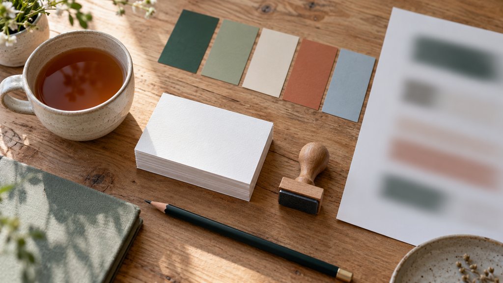
Free Brand Kit Generator: Palette, Fonts, Type Scale and a Style Guide
This brand kit generator turns a name and a mood into a visual identity: five colours with every text pairing checked for contrast, a tested font pairing, a type scale and a set of previews on a business card, a web header and a poster. Export the result as CSS variables, design tokens or a one-page brand sheet.
Build your brand kit
Palette
- Primary
- Secondary
- Accent
- Ink
- Paper
| Text on background | Ratio | Normal text | Large text |
|---|
Type
Your brand in use
CSS variables
How to use the brand kit generator
Start with a name and a short tagline, then choose a mood. The brand kit generator uses the mood to pick a starting palette and a matching font pairing, so Calm leans towards soft greens and a gentle serif, while Bold reaches for saturated red and a heavy grotesque. Every later step can be changed by hand.
Ask for new palettes until one feels right, and tick Keep on any colour worth holding on to. Then work down the page: confirm the contrast table, choose a font pairing, set a type scale and check the previews. The kit is complete when the business card, the website header and the poster all look like the same brand.
Nothing is stored after the tab closes. To come back later or send the kit to a colleague, copy a link: it carries every choice, including kept colours, the pairing and the scale. Opening the link rebuilds the same kit, which makes it easy to compare two or three directions side by side before choosing one.
Five colours with a job each
The palette has five roles rather than five equal colours. Primary is the colour people should remember, used for the logo and main buttons. Secondary supports it in larger areas, accent is reserved for small highlights, ink carries body text and paper is the light background most pages sit on. Each role has a clear place to appear.
Generated palettes follow the same colour harmony rules as the color palette generator. The secondary sits a set angle away from the primary on the colour wheel, the accent falls roughly opposite, and the ink and paper are very dark and very light versions tinted towards the primary, so even the neutrals belong to the same family.
Kept colours never move. Enter an existing brand colour, tick Keep, and every new palette is built around it. That turns the brand kit generator into a quick way of finding companions for a colour you are already committed to, from a shop sign or a packaging run that cannot change, without guessing which neutrals will suit it.
Contrast checked before anything ships
Every pairing the kit uses is measured with the contrast formula in WCAG 2.2: ink on paper for body text, light or dark text on the primary for buttons, and the same on the secondary and accent. Normal text needs a ratio of at least 4.5 to 1, while large headings and interface parts need 3 to 1.
The tool chooses ink or paper as the text colour on each background automatically, taking whichever gives the higher ratio. A failing row still appears, because hiding problems would be worse. The color contrast checker explains the thresholds and the arithmetic in more detail, including why some bright yellows can never carry white text.
Fonts and a type scale that fit together
Seven pairings are on offer, each a display face with a sturdier companion for reading. A modern serif with a geometric sans suits calm brands, a heavy grotesque suits loud ones, and a brush script works only for names and short lines. A one-line note explains why each pairing works, and the font pairing tool covers more combinations.
The type scale multiplies a body size by a fixed ratio to get every heading size, so the steps feel related rather than random. Small ratios such as 1.2 keep headings modest for long reading, and larger ratios such as 1.5 create poster-style jumps. The type scale calculator explains the musical names behind each ratio.
Seeing the free brand kit in use
Colours and fonts are hard to judge in isolation, so the free generator shows them at work straight away. The business card puts the name and monogram on paper, with the reverse in the primary colour. The website header tests the button and body text, and the poster tests the headline at a large size against the secondary colour.
Look for the weakest preview rather than the best one. A kit that looks lovely on the card but muddy on the poster usually has a secondary too close to the ink or an accent that fights the primary. Adjust one colour at a time, watch the contrast table, and stop when all three previews hold together.
Exporting a style guide, CSS and tokens
The brand sheet downloads as a single PNG laid out like a compact style guide: name and monogram, the five colours with their codes, the font pairing and the type scale. It suits a pitch deck, a shared drive or the first page of a fuller style guide written later, when the brand has more decisions to record.
For a website, copy the CSS variables. They define every colour, both font families and each step of the scale as custom properties, ready to paste into a stylesheet. The JSON export holds the same values as design tokens in the draft format of the W3C community group, which several design tools and code libraries can import.
How the brand kit generator builds a kit
The brand kit generator runs entirely in the browser, and nothing is uploaded. A palette is generated from the mood’s range of hue, saturation and lightness, seeded by the brand name, so the same name and mood always produce the same first palette. Contrast follows the WCAG 2.2 relative luminance formula, with no approximation or rounding.
The limits are deliberate. The kit covers colour, type and a simple monogram, not photography, illustration or tone of voice, which a full style guide would add later. The type suggestions are limited to open typefaces, so every export can be used straight away without buying a licence or checking the small print of a commercial font.
Questions about the brand kit generator
What is a brand kit?
A brand kit is the small set of decisions that make a brand look consistent: its colours, its typefaces, how large text should be at each level, and how the name is set. Larger organisations publish the same decisions as a style guide or brand book, often with rules for photography, tone of voice and logo spacing.
Is this brand kit generator free?
Yes. The generator is free, needs no account and adds no watermark to anything it exports. The typefaces it suggests are released under the SIL Open Font License or the Apache licence, so they can be used in commercial work. Colours cannot be owned as such, though a famous combination may still be part of a trademark.
How does the contrast check work?
The tool calculates the contrast ratio defined in WCAG 2.2 for each text and background pairing the kit uses. Normal text needs at least 4.5 to 1, and large text or interface parts need 3 to 1. When a pairing fails, change one colour slightly or swap the text colour, and the table updates at once.
Can I use my existing brand colour?
Yes. Click any swatch to open the colour picker, enter your exact colour and tick Keep. Kept colours stay in place when you ask for a new palette, so the generator builds the remaining colours around them. The contrast table shows straight away whether your colour works for text, buttons and backgrounds.
What are design tokens?
Design tokens are named values, such as a colour or a font size, stored in a file that both designers and developers can read. The JSON export follows the draft format of the W3C Design Tokens Community Group, which lists each value with a type, so the kit can be imported into design tools or a code project.
Which type scale should I choose?
A ratio of 1.2 or 1.25 suits text-heavy websites and apps, because headings stay close to body size. A ratio of 1.333 or 1.5 creates bigger jumps that work for marketing pages, posters and presentations. Body size matters too: 16 pixels is the browser default, while 18 pixels reads more comfortably for long articles.
Does the tool make a logo?
It sets the brand name in the heading typeface and adds a simple monogram, the first letter in a circle, so the previews feel complete. That is a starting point rather than a finished logo. A distinctive mark usually needs drawing by hand, testing at small sizes and checking that nothing similar is already registered.