McDonald's Logo History: How the Golden Arches Became a Logo
McDonald's logo history is unusual because the logo was a building first. The golden arches were structural arcs on a 1953 roadside restaurant, lit with yellow neon so drivers could spot them. Only in 1962 did the company make them its logo, and in 1968 the pair of arches was redrawn into the M that is still used.
McDonald's logo versions at a glance
- 1962
- #FFC72C
- #DA291C
Two golden arches seen at an angle, overlapping into an M, with a slanted line through them suggesting a roof. - 1968
- #FFC72C
- #DA291C
Roof line removed; the arches joined into a smooth, symmetrical double-arch M that reads as a letter. - 2003
- #FFC72C
- #DA291C
- #27251F
Golden arches used alone or with the lowercase line i'm lovin' it in place of the company name.
Before the arches: Speedee and a drive-in
In 1940 Richard and Maurice McDonald opened a drive-in restaurant in San Bernardino, California. In 1948 they rebuilt it around a short menu and a fast assembly line they called the Speedee Service System, selling hamburgers for fifteen cents. Their first mascot was named after that system. He was a running chef called Speedee.
Speedee appeared on signs, wrappers and the roadside, a cheerful little figure built for drivers passing at speed. A sixty-foot single-arch sign carrying him still stands at the oldest surviving McDonald’s, in Downey, California. If you want to see where McDonald’s logo history begins, that sign is about as close as anyone can get today.
1953: golden arches as architecture
The arches started as a building problem. Dick McDonald thought the roofline of their restaurant was too flat to catch a driver’s eye, so the 1953 design added two large arcs, one at each end. Architect Stanley Meston drew them. They were structural bookends, tall enough to be seen from a long way down the road.
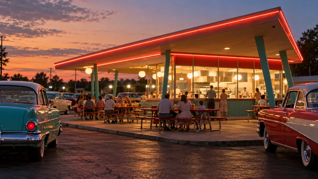
A sign maker then outlined the arcs in yellow neon. At night they glowed, and people started calling them the golden arches. The first franchised restaurant built with them opened in Phoenix, Arizona, in 1953. McDonald’s says that red and white building, with its sloping roof and arches, stayed in use until the late 1960s.
There is a short digression worth making here. Most logos start on paper and later move onto buildings. This one went the other way, and that order explains its shape. The arches were sized to be seen from a moving car, which is partly why they still read clearly on a phone screen today.
How the arches became the logo in 1962
Ray Kroc opened his first McDonald’s in Des Plaines, Illinois, in 1955 and bought out the brothers in 1961. The growing company needed a symbol it could own outright. In 1962, according to McDonald’s own timeline, the golden arches became the company logo, and Speedee was retired from that job.
The 1962 drawing is usually credited to Jim Schindler, who ran engineering and design. He showed the two arches as they looked from the road at an angle, overlapping into an M, with a slanted line cutting through them for the roof. It was more a picture of a restaurant than a letter. That changed quickly.
The 1968 M and the evolution of McDonald’s logo history
In the late 1960s the company moved to a new building style with a mansard roof, and the arches left the architecture. They survived only as a symbol. In 1968 the logo was redrawn: the roof line disappeared, the two arches joined into a smooth, symmetrical M, and the shape became a letter rather than a building.
That 1968 evolution is the most important step in McDonald’s logo history. Without the slanted roof the mark no longer depended on anyone remembering the old restaurants. It simply read as M for McDonald’s. Yellow arches over a red field became the standard signature on signs, cups and trays through the 1970s and 1980s.
The Canadian chapter of the story arrived in the same decade. McDonald’s opened its first restaurant in Canada in Richmond, British Columbia, in 1967, a year before the redraw. The double-arch M soon became a fixture on Canadian roadsides, as familiar to drivers there as the Tim Hortons script would later be.
Golden arches without words
From the 1990s onward McDonald’s increasingly let the arches appear alone, without the company name. In 2003 the brand launched its first global campaign, built around the line i’m lovin’ it, and the arches were often paired with that phrase instead of the name. The slogan survives in 2026, a long run among famous slogans.
Colour has been the main variable in the later evolution. Red backgrounds dominated for decades. In many markets during the 2000s and 2010s, restaurants shifted toward darker, quieter exteriors, sometimes with yellow arches on charcoal or green. The arches stayed yellow. Even when the red disappeared, nobody mistook the restaurant for anything else.
McDonald’s logo history from 2020 to 2026
As of October 2026 the golden arches have not been redrawn. The M is cropped, enlarged and animated in advertising, and it has been reduced to simple yellow curves on packaging, yet the 1968 letterform holds. Few corporate symbols can claim nearly sixty years with no change to their basic outline.
That stability makes the arches a useful control in any comparison. Brands that rebuilt their marks around the same time, from cola companies to airlines, often went through three or four versions. The logo history hub sets those against McDonald’s, and the Starbucks siren offers another food chain that trimmed rather than replaced.
What McDonald’s logo history says about simple shapes
Read as a whole, McDonald’s logo history is a lesson in subtraction. A mascot gave way to a building, the building gave way to a drawing of itself, and the drawing gave way to a letter. Each step removed a detail that only made sense in one place or one decade, until what remained could work anywhere.
Speedee’s quiet afterlife
Speedee did not disappear entirely. His sign still lights up in Downey, and the character turns up in museum displays and retro merchandise. A brand that once relied on a mascot now relies on a letter, which is the reverse of what happened to many of the brand mascots that outlived their companies’ original logos.
The early restaurant buildings are rarer now than the sign. A few survive with their original arches, and the Downey location still has its walk-up windows and red and white tiles. Stand there at dusk and you can see the logo as it was first meant to be seen: two lit arcs beside a road, waiting for a car.
Questions about the McDonald's logo
Who designed the McDonald's golden arches?
The arches began as architecture. Richard McDonald wanted the 1953 restaurant design to stand out because he felt the roofline was too flat, and architect Stanley Meston drew the building with two large arcs. A sign maker added yellow neon. The 1962 logo is usually credited to Jim Schindler, who ran engineering and design.
What was McDonald's first logo?
Before the arches, the brothers' restaurant used a running chef character called Speedee, named after their Speedee Service System from 1948. Speedee appeared on signs and packaging, and a sixty-foot single-arch Speedee sign still stands at the oldest surviving McDonald's in Downey, California. The arches replaced him as the company symbol in 1962.
What does the McDonald's M stand for?
The M is two arches seen side by side, so it doubles as the first letter of the company name. That was a happy result of turning a building into a symbol. The 1962 logo showed the arches at an angle, like a restaurant seen from the road; the 1968 redraw made them a clean letter.
Why are the McDonald's arches yellow?
They were yellow from the start, because a sign maker outlined the original building arches in yellow neon so that drivers could see them at night. The colour stuck when the arches became a logo. Red was used as a background on many signs and packages, and the pairing of yellow and red still defines the brand.
Has the McDonald's logo changed recently?
Not in shape. As of October 2026 the double-arch M drawn in 1968 is still the core of the McDonald's identity. Packaging, store design and the way the arches are cropped or coloured have changed many times, but the letterform itself has stayed recognizably the same for nearly sixty years.