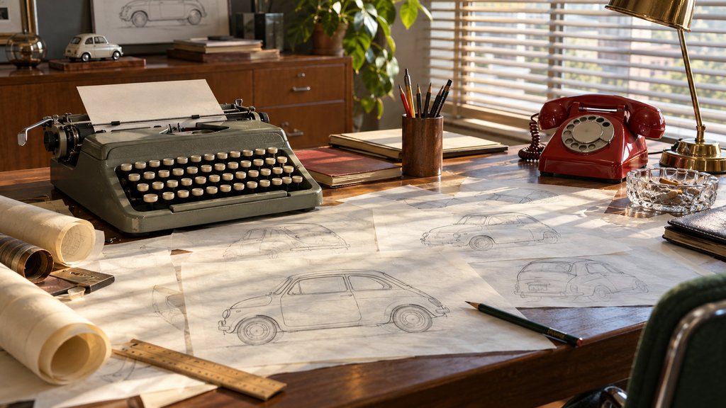
1960s Advertising: The Creative Revolution of the Mad Men Era
1960s advertising is remembered for a short list of ads that broke the rules: a small car sold as small, a rental company that admitted it came second, a soft drink sold as a generation. This page looks at the creative revolution behind them, the Mad Men era myths, and what the decade still teaches.
Why 1960s advertising still gets studied
Pick up any advertising textbook and the 1960s take up more pages than their length deserves. The decade produced a cluster of ads that copywriters still pin above their desks. It also produced a television show, decades later, that turned the business into costume drama. Separating the two is most of the fun of studying 1960s advertising.
Before 1959, most American ads followed a formula. A headline promised a benefit, a smiling family illustrated it, and dense copy explained why the product beat its rivals. It worked, more or less. Then a German car with no styling changes from year to year made the formula look tired, and other brands followed within a few seasons.
The creative revolution begins with a small car
Volkswagen’s “Think Small” ran in 1959. The page was mostly white space, with a tiny Beetle near the top and a short headline in Futura below. The copy joked about the car’s size instead of hiding it. A year later came “Lemon,” a photo of a perfect-looking Beetle that an inspector had rejected over a blemished chrome strip.
The tone was the shock. Readers were used to being told that every product was the biggest and best, and here was an ad that admitted limits and trusted them to get the joke. Historians later named the period the creative revolution, partly because writers and art directors began working as pairs rather than handing pages down a line.
Avis took the honest approach further in 1962 with its “try harder” pitch. The rental company openly said it was number two to Hertz, and argued that second place made its staff more careful. Clean ashtrays and full tanks became selling points. The line lasted for decades, which is unusual for any slogan, let alone a confession.
Television takes over the living room
Print still mattered, but by the middle of the decade television carried the money. The networks were moving prime time to colour, and brands wanted to be seen in it. Pepsi named its customers the “Pepsi Generation” in 1963, betting on youth rather than on taste. Coca-Cola answered the same year with “Things go better with Coke.”
Mascots and jingles filled the breaks. Esso pushed “Put a tiger in your tank” nationally in 1964, with a cartoon tiger on television and fake tiger tails hanging from petrol caps. Cereal brands built whole cartoon casts for Saturday mornings, and many of the brand mascots still in use today were refined during these years.
On September 7, 1964, the Johnson campaign aired “Daisy,” in which a girl counts petals before a countdown and a nuclear blast. It ran as a paid ad only once. News programs replayed it for free, an early lesson in how controversy multiplies reach, and one that later viral marketing campaigns would copy deliberately.
Cigarettes, women and the limits of the Mad Men era
Tobacco was one of television’s biggest spenders, and the Marlboro cowboy had become one of its best known faces. The Surgeon General’s report of January 11, 1964, linked smoking to lung cancer and began the long retreat. Congress later banned cigarette commercials from American radio and television, effective January 2, 1971. Print and billboards carried on for years.
Ads aimed at women in the Mad Men era mostly showed homemakers. Floors gleamed, coffee pleased husbands, and appliances promised free afternoons. When the women’s movement grew, brands borrowed its language fast. Virginia Slims launched in 1968 with “You’ve come a long way, baby,” selling a cigarette as liberation. Few ads show the decade’s contradictions so neatly.
What the Mad Men era got right, and what it invented
The series Mad Men ran on AMC from 2007 to 2015 and opens in March 1960. It gets the offices, the ashtrays and the cocktails broadly right. It also made one fictional creative director the source of every big idea, which flatters the myth. In real offices the best 1960s advertising came from teams arguing over layouts for weeks.
The fictional campaigns are worth a second look anyway. Several episodes put real brands on screen, including Kodak and Hilton, and the writers built pitches around actual products of the period. You can watch the show as a primer on the period’s slang, then compare it with real ads in the Ad*Access and AdViews collections at Duke University.
How the creative revolution looked on the page
Design changed with the copy. Layouts grew sparser and photographs replaced painted illustration. Sans serif type took over, helped along by Helvetica, released in 1957, and by the geometric Futura in Volkswagen’s pages. The typography basics guide explains why those faces read so cleanly at small sizes on cheap newsprint.
Colour shifted too. Early 1960s ads lean on mustard, turquoise and coral, while the late decade brought the saturated oranges and purples of psychedelic posters. Packaging followed. Canadian design had its own moment as well: Canadian National Railways adopted Allan Fleming’s flowing CN mark in 1960, a logo still in use more than sixty years later.
1960s advertising in Canada
Canadian advertisers of the decade mostly adapted American campaigns, sometimes with French versions for Quebec that took on a life of their own. The CBC dominated television until CTV launched in 1961, giving national advertisers a second network. Expo 67 in Montreal, with its stark modernist signage, showed Canadians a cleaner graphic style than most of their commercials did.
Plenty of Canadian 1960s advertising survives only in magazines like Maclean’s, scanned page by page by libraries. The Canadian commercials page picks up where they leave off, in the 1970s and 1980s. And if you want to see the full sweep in order, the timeline places “Think Small” next to what came before it.
Questions about 1960s advertising
What was the creative revolution in advertising?
The creative revolution was a shift in American advertising from about 1959 to the late 1960s. Copywriters and art directors began working side by side, and ads became shorter, wittier and more honest in tone. Volkswagen's "Think Small" and the Avis campaign that admitted to being number two are the examples most often given for the change in approach.
What were common 1960s advertising slogans?
Several lines from the decade are still quoted. Avis promised to try harder from 1962, Coca-Cola ran "Things go better with Coke" from 1963, and Pepsi called its drinkers the "Pepsi Generation" the same year. Esso pushed "Put a tiger in your tank" nationally in 1964, and Virginia Slims arrived in 1968 with "You've come a long way, baby."
How were women portrayed in 1960s ads?
Most ads showed women as homemakers and buyers for the household, judged by spotless floors, fresh coffee or a husband's approval. Ads aimed at working women were rare until late in the decade. Virginia Slims in 1968 sold a cigarette with a liberation theme, which shows how quickly brands borrowed the language of social change.
Is Mad Men accurate about 1960s advertising?
The series gets the look, the office hierarchy and the heavy drinking and smoking broadly right, according to many people who worked in the business. It compresses events and invents its campaigns, of course. Real breakthroughs of the period came from many hands at once, not from one lone genius pitching to a client in a single meeting.
What fonts did 1960s ads use?
Clean sans serifs spread fast. Volkswagen's print ads set their headlines in Futura, a geometric typeface from 1927, and Helvetica, released in 1957, appeared everywhere by the end of the decade. Mid-century ads also used friendly script lettering and heavy rounded faces, especially for food, toys and household products aimed at families.